Built on Clarity
A research-focused website connecting brand presentation, documentation discovery and account access through a clear public experience.
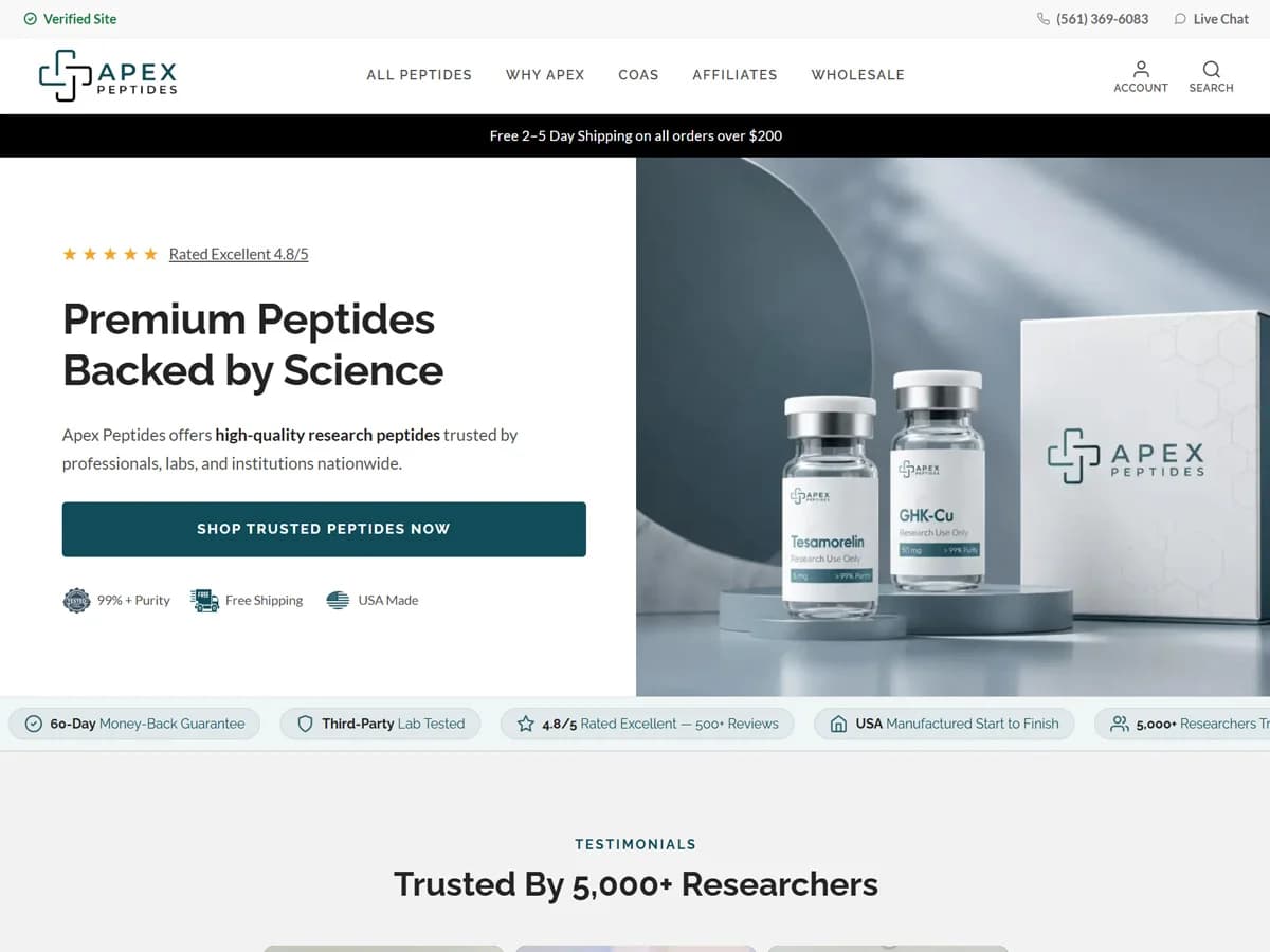
Project overview
Apex Peptides Lab presents a research-focused ecommerce brand through a public website that combines product imagery, quality information and documentation links. The experience introduces the business before directing visitors into account-based shopping. This case study examines the visible website structure and the way it supports information discovery.
The project story centers on clarity: separating brand positioning from supporting documentation, making key destinations visible and giving visitors a recognizable next step. The public pages provide a useful record of the experience. They do not establish the private implementation scope or the commercial effect of any agency work.
Challenge
A specialist catalog carries a substantial information burden. Visitors need to identify what the business offers, where to review its evidence and how to continue into the shopping area. A homepage can introduce those tasks, but a single promotional statement cannot complete all of them. The website needs clear relationships between its introduction, quality explanation and documentation destination.
The account requirement creates an additional transition. A visitor following the Shop link reaches a sign-in page rather than an open catalog. That transition needs to explain why the browsing journey has changed and provide an understandable route forward. The public sign-in screen supplies this context without exposing private account content.
The central design challenge is therefore information hierarchy. Each part of the experience must have a defined role: establish the brand, guide a visitor toward further detail or explain the next interaction. This interpretation describes the visible design problem; it does not imply access to the original project brief.
Approach
Make the main destinations recognizable. The header groups catalog access, brand information, COAs, affiliate information and wholesale navigation. Those labels let visitors identify different tasks before committing to a longer page. Account and search controls add familiar entry points around that navigation.
Give the first screen a focused role. The homepage pairs a large heading and shopping action with branded product photography. Its research-use notice appears prominently above the introductory area. The design uses a restrained palette, strong type hierarchy and substantial product imagery to establish a consistent visual identity.
Separate explanation from evidence access. The quality page develops the brand narrative, while the COA page offers a distinct documentation destination. This separation is useful as an information architecture choice: visitors can read the positioning and then inspect the available records through a specifically labeled route.
Use progressive detail. Introductory sections provide orientation, while deeper pages support focused reading. The homepage FAQ groups questions into five topics. As a design pattern, topic grouping helps a substantial body of information remain navigable instead of presenting every question with equal prominence.
Documentation discovery
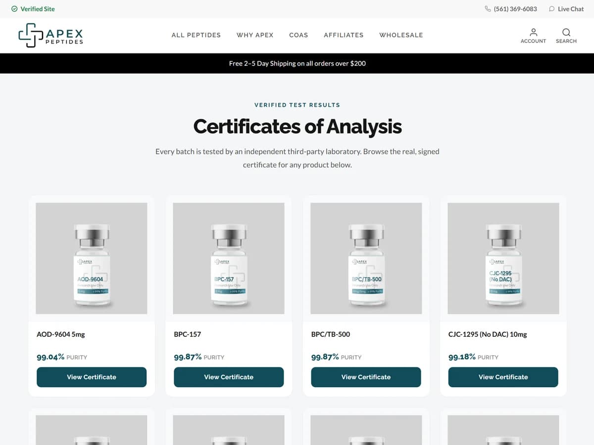
The Certificates of Analysis page presents a grid of named entries with certificate actions and, for many items, displayed purity values. Its layout gives documentation a dedicated public place in the website rather than leaving it hidden behind a general contact request. The screen included here shows the index; the underlying laboratory reports were not independently audited.
Consistent cards make the entries easier to scan. Each card identifies the subject and offers an action for further inspection. That recurring structure supports a specific visitor task: locating the available certificate associated with an item. It is a visible interface feature, not proof of a particular backend document-management system.
The page also demonstrates why numerical statements need careful treatment. General purity messaging varies across the website, and the certificate index includes values below 99 percent. This case study avoids turning a broad promotional threshold into a verified universal claim. A publication-ready quality statement should be matched to the relevant dated record.
Quality information and brand presentation
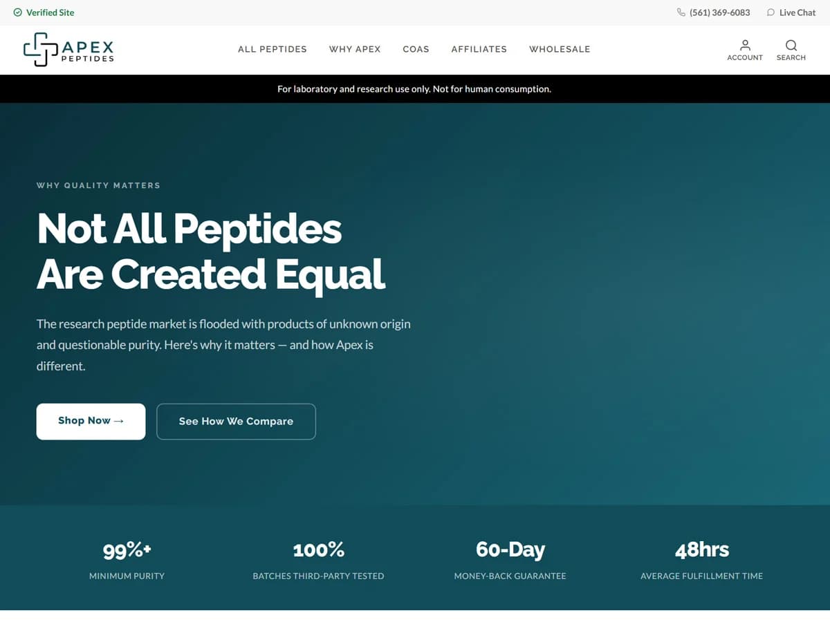
The Why Apex page organizes the brand’s quality positioning into introductory content, numbered explanations, a comparison area and a closing invitation. This gives the reader a longer-form destination beyond the homepage. Its statements about testing, production and storage are the business’s representations, not independently verified findings of this case study.
The layout alternates concise headings with explanatory paragraphs. Numbering distinguishes related topics, while the comparison section presents repeated attributes in a common structure. These choices create visual anchors for readers moving through a detailed page.
From a design perspective, this page has a specific purpose: expanding the brand narrative without forcing the homepage to carry every explanation. Its relationship with the COA destination creates a visible route from general positioning to available documentation. The visual result can be demonstrated without claiming laboratory accreditation or guaranteed product outcomes.
Account access and visitor pathways
Public catalog navigation currently redirects to an account entry screen. The screen states that an account is required to shop and order, and presents Sign In and Create Account options alongside email and password fields and a recovery link. This is the verified public entry point; catalog behavior after authentication was not inspected.
Account access changes the story a case study can responsibly tell. The visible journey covers discovery and the transition into sign-in, while private catalog browsing, checkout, order processing and customer dashboards require separate evidence. No purchase, registration or payment submission was performed.
Affiliate and wholesale labels identify additional audience pathways in the public navigation. Their presence makes those destinations discoverable, but does not establish private commission tracking, partner permissions or wholesale pricing logic. Those details should be added only from confirmed delivery records.
Technical context
The fetched homepage includes Next.js static asset paths and optimized image URLs. Some image sources point to a WordPress content host. This supports a narrow technical observation about the delivered page: a Next.js frontend asset structure with externally hosted media. It does not establish the full commerce engine, hosting configuration or integration architecture.
The visible interface can be described independently of those unknowns. Header navigation, distinct public information pages, card-based documentation and account entry are concrete features. Private code ownership, migration work, custom API development and SEO implementation remain outside the inspected evidence.
Result
The public website brings brand introduction, quality positioning, documentation discovery and account access into a connected experience. Its strongest demonstrated outcome is the organization of these tasks across recognizable destinations. Actual screenshots provide evidence of the presentation rather than relying on invented interface mockups.
No analytics baseline, conversion comparison, revenue report or performance benchmark was supplied. Results are therefore described as visible website delivery, with no numerical growth attributed to the project. Exact 1Dot Digital responsibilities should be confirmed before publishing agency ownership or optimization claims.
The transferable lesson is practical: a specialist website becomes easier to assess when visitors can distinguish promotional positioning, supporting information and the next interaction. Apex presents those roles through its homepage, quality page, documentation index and sign-in route.
Ready to strengthen your digital experience?
Bring your product story and shopping journey together with 1Dot Digital.